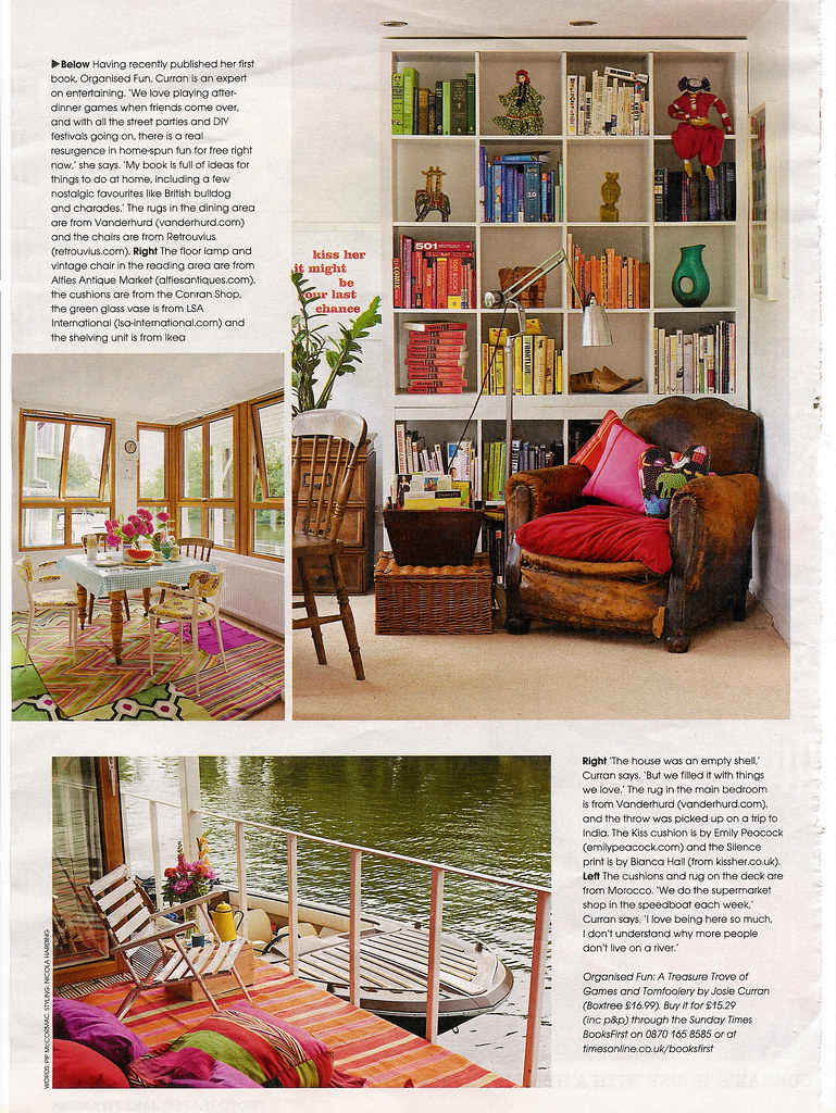
"Young designers should understand a career path in interior design rarely plays in a straight line."
Gioi Tran, Applegate Tran Interiors



 Image from the design files. (check this amazing website).
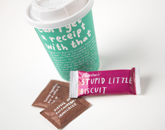 This is such an original approach to packaging! These were made for an UK coffee shop called Puccino's. This brand doesn't take itself too seriously and that's such a rare capacity.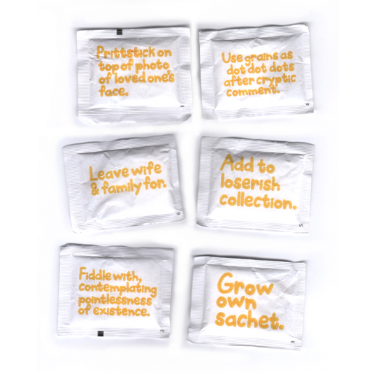
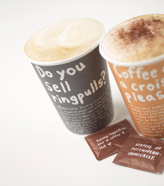
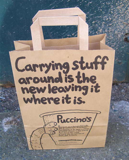
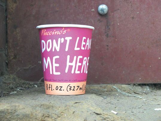 Designed by Jim Smith | Country: United Kingdom
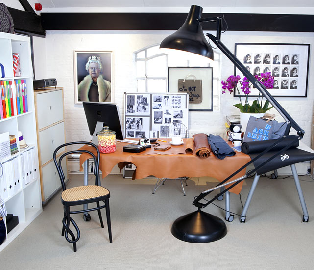 This is the office of Anya Hindmarch, a British handbag designer.
 "Our first idea was to create a headline face built up by combining straight lines with brush-stroke elements. How could we create a complete design with this system that would still maintain enough consistency?
 "As we were filling out the heavy weight, we asked ourselves if the same design principles might also be applicable to a light version. In order to create the largest amount of contrast with our heavy cut, we decided upon a hairline weight; one that would only employ the lightest, seemingly monoline strokes."
 "From the completed ITC Chino Regular, we developed a Black and a Light weight. With a MultipleMaster axis, we interpolated the Medium and Bold. These two raw results were then optimized by hand. This way, we could give each weight its own individual details."
 "To sit alongside the five upright fonts, we added Italic variants. The characters from the upright files were obliqued, and then optically corrected. Outstroke terminals were added, and the letters a, f, and g — as well as a few others — were replaced with “true Italic” versions."
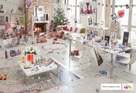 This was an ad campaign made for Ebay by Euro RSCG Paris with the baseline "Christmas is coming".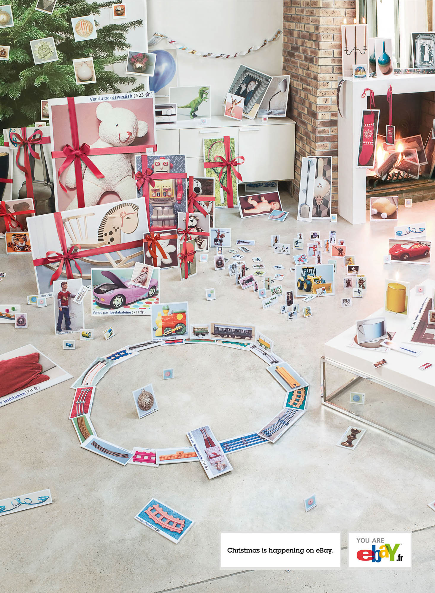
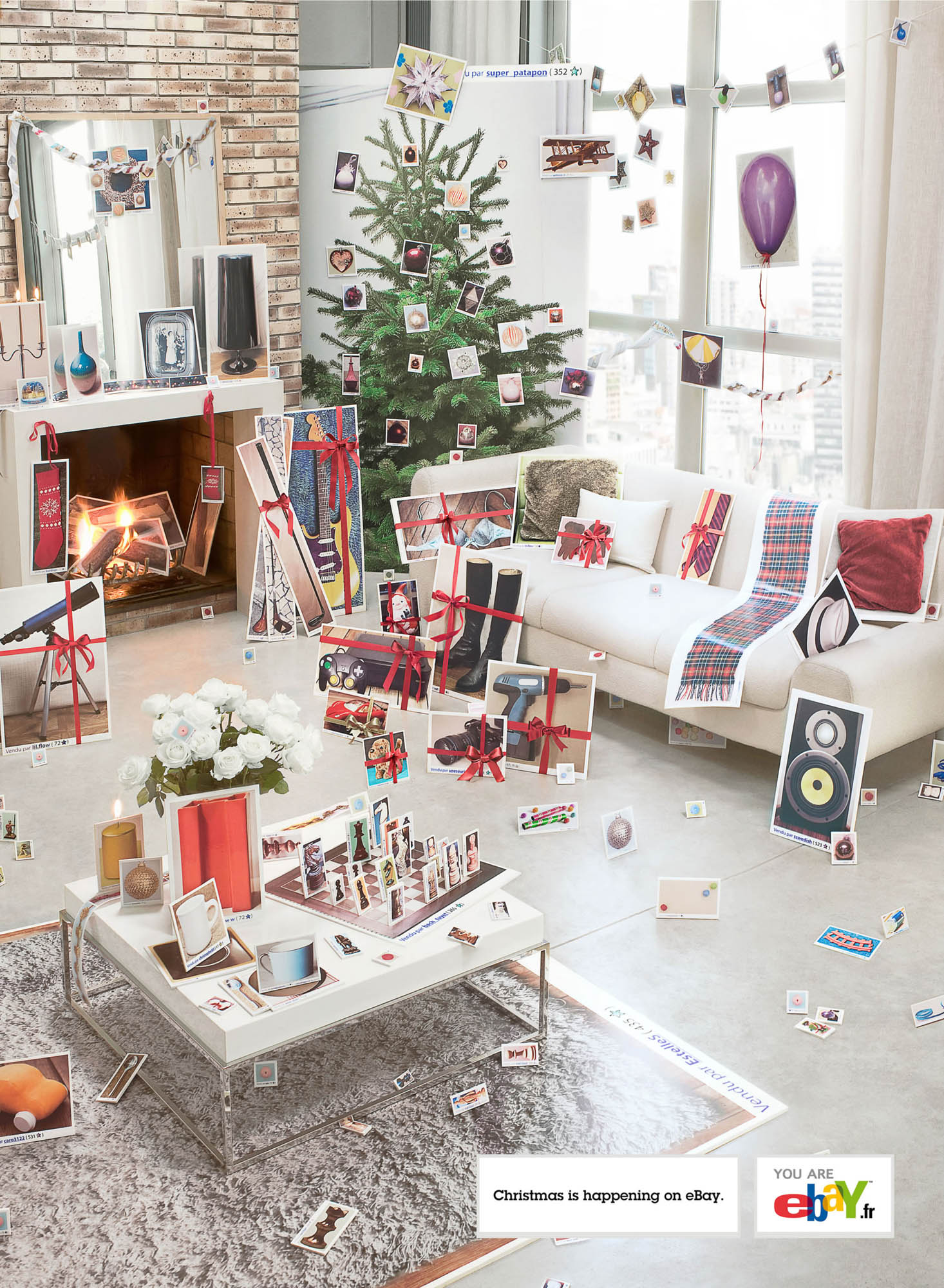 via fubiz


 They are made by {flaire houre} and you can buy them here. Remember that these are almost always one of a kind.
 This is an artwork from Lena Corwin made of paper and straw. In her blog she says that this cool idea came from Laura Normandin'd blog in this post about a polish paper chandelier (below).
 She bought it at The Polish Art Centre and out of curiosity I looked for it online. And among the varieties they had I found this picture with a different and interesting angle (below).
 The price of each chandelier is around $125 american dollars but there are cheaper ones. The Polish Arte Centre ships internationally, but you need to create an account and then see if your country is on the list.
 The whole list of sentences:

I have created a brand for a little market, that sells products of its own farm. Is called FOOD LOVERS. This brand is for people who appreciate tasty food, like to know where they came from, and care about all the elements involved in its production. The typography was created after a research on little markets, where the products are traditionally mentioned on a blackboard, in large separated letters written with a piece of chalk.
The idea of the hand in the brand come up because it is the greatest instrument that a person needs to do cooking. With the hand the sauce is tasted, the salt is sprinkled, the dough is kneaded, the quantity of oil is controlled, the limon is squeezed, the bread is sliced, and so on. The changing symbol shows the movement of the hole process of cooking. The hands interact with the typography of chalk, “tasting” and “preparing” it, as if it was fresh food, came right from the farm."
 Text and images from Thedieline
 I like messy workspaces because it's like having your creativity flow free. The "white canvas" can be too scary and oppressing. The problem in this room for me? Too difficult to clean the dust:P
 This is the workspace of Kate Bingaman-Burt, an artist from Oregon, Portland. Go to her website at Obsessive Consumption. She is truly original:)
 This is such an interesting idea! Art on walls doesn't have to be rocket science =D
 One more example of a creative response to a need. No more "where are plates?":P
 Do you like this hallway? I'm not sure. It's a big statement that's for sure. And it works really well when all you need is a clean space with no clutter or decorative items, because the wallpaper is the star.